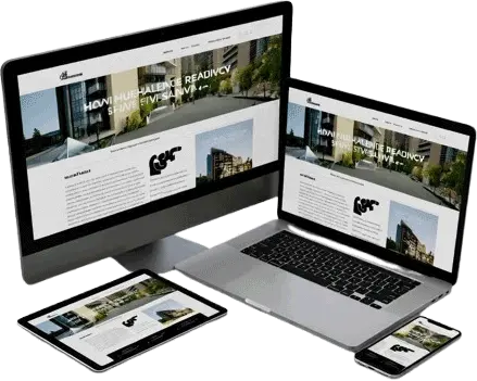
Responsive web design is a crucial concept in modern web development. It ensures that a website looks and works well on all devices — from large desktop monitors to small mobile screens.
What is Responsive Design?
Responsive design means the layout automatically adjusts to fit the screen size and orientation of the device. It provides users with a consistent and optimized experience across all screen sizes.
Key Goals:
- Easy reading and navigation without zooming or scrolling.
- Proper scaling of images, text, and layout.
- Smooth adaptation between portrait and landscape modes.
Core Techniques of Responsive Design
Viewport Meta Tag
This tag tells browsers how to control the page’s dimensions and scaling.
<meta name="viewport" content="width=device-width, initial-scale=1.0">Explanation:
width=device-width: sets the page width to match the device screen width.initial-scale=1.0: sets the initial zoom level when the page is loaded.
Responsive Layout with CSS
Using Percentages
Use percentages instead of fixed pixel values to make layouts flexible.
<style>
  .container {
    width: 90%;
    margin: auto;
  }
</style>
Using Flexbox or Grid
Modern CSS layout systems make building responsive layouts easy.
<style>
  .flex-container {
    display: flex;
    flex-wrap: wrap;
  }
  .box {
    flex: 1 1 300px;
    margin: 10px;
    background: lightblue;
  }
</style>

<div class="flex-container">
  <div class="box">Box 1</div>
  <div class="box">Box 2</div>
  <div class="box">Box 3</div>
</div>
CSS Media Queries
Media queries allow styles to change depending on device characteristics (like screen width).
<style>
  body {
    background-color: lightblue;
  }

  @media (max-width: 600px) {
    body {
      background-color: lightcoral;
    }
  }
</style>
Explanation:
When the screen width is 600px or less, the background color changes to lightcoral.
Responsive Images
Using max-width
<style>
  img {
    max-width: 100%;
    height: auto;
  }
</style>

<img src="nature.jpg" alt="Beautiful Nature">
This ensures the image resizes according to the container width.
Using <picture> Element
<picture>
  <source srcset="large.jpg" media="(min-width: 800px)">
  <source srcset="small.jpg" media="(max-width: 799px)">
  <img src="default.jpg" alt="Responsive image">
</picture>
Responsive Text
Use relative units like em, rem, vw instead of px.
<style>
  h1 {
    font-size: 5vw; /* 5% of viewport width */
  }
</style>
Frameworks for Responsive Design
You can use CSS frameworks that include built-in responsive grids and utilities:
- 🟦 Bootstrap
- 🟢 Tailwind CSS
- 🟧 Foundation
Example (Bootstrap Grid):
<div class="container">
  <div class="row">
    <div class="col-md-6">Left</div>
    <div class="col-md-6">Right</div>
  </div>
</div>
Best Practices
- Always use the viewport meta tag.
- Test your layout on multiple devices and orientations.
- Avoid fixed-width elements.
- Use flexible grid systems and relative units.
- Optimize images for mobile screens.
Example: Complete Responsive Page
<!DOCTYPE html>
<html lang="en">
<head>
<meta charset="UTF-8">
<meta name="viewport" content="width=device-width, initial-scale=1.0">
<title>Responsive Webpage Example</title>
<style>
body {
font-family: Arial, sans-serif;
margin: 0;
padding: 0;
}
header, footer {
background-color: #29AB87;
color: white;
text-align: center;
padding: 15px;
}
.container {
display: flex;
flex-wrap: wrap;
padding: 20px;
gap: 10px;
}
.box {
flex: 1 1 300px;
background-color: #f4f4f4;
padding: 20px;
border-radius: 8px;
text-align: center;
}
img {
max-width: 100%;
height: auto;
border-radius: 6px;
}
@media (max-width: 768px) {
header, footer {
font-size: 16px;
padding: 10px;
}
}
</style>
</head>
<body>
<header>
<h2>HTML Responsive Design Example</h2>
</header>
<div class="container">
<div class="box">
<h3>Flexible Layout</h3>
<p>The layout automatically adjusts to fit the screen size.</p>
</div>
<div class="box">
<h3>Responsive Image</h3>
<img src="https://picsum.photos/id/237/200/300" alt="Nature Image">
</div>
<div class="box">
<h3>Media Queries</h3>
<p>Media queries help to apply styles for different screen widths.</p>
</div>
</div>
<footer>
© 2025 HTML5 & CSS3 — Responsive Design Demo
</footer>
</body>
</html>Try resizing your browser — the layout and image will adjust automatically.
Summary Table
| Concept | Description |
|---|---|
| Viewport Meta Tag | Sets screen width and scaling |
| Flexible Layouts | Use percentages instead of fixed widths |
| Responsive Images | Scale images using max-width: 100% |
| Media Queries | Apply different styles for screen sizes |
| Flexbox/Grid | Create fluid, adaptive layouts |
| Frameworks | Bootstrap, Tailwind, Foundation make responsiveness easier |