CSS Flexbox vs CSS Grid: Which One Should Beginners Learn First?
Author
Swapnil Raja
Founder of HTML5ANDCSS3.org and creator of its tutorials and tools.
Focused on practical frontend learning through real examples and hands-on utilities.
View profileWhen beginners start learning CSS layout, two names appear again and again: Flexbox and CSS Grid.
Both are powerful. Both are modern. Both are used in real websites. But this also creates confusion.
- Should you learn Flexbox first?
- Should you learn Grid first?
- Which one is better for responsive design?
- Can you use both together?
The simple answer is: learn Flexbox first, then learn CSS Grid.
Flexbox is easier for small layouts, alignment, navigation bars, buttons, cards, and one-direction layouts. CSS Grid is better for full page layouts, complex sections, galleries, dashboards, and two-direction layouts.
Let's understand the difference in a beginner-friendly way, especially if you are still working through the CSS Tutorial.
What Is CSS Flexbox?
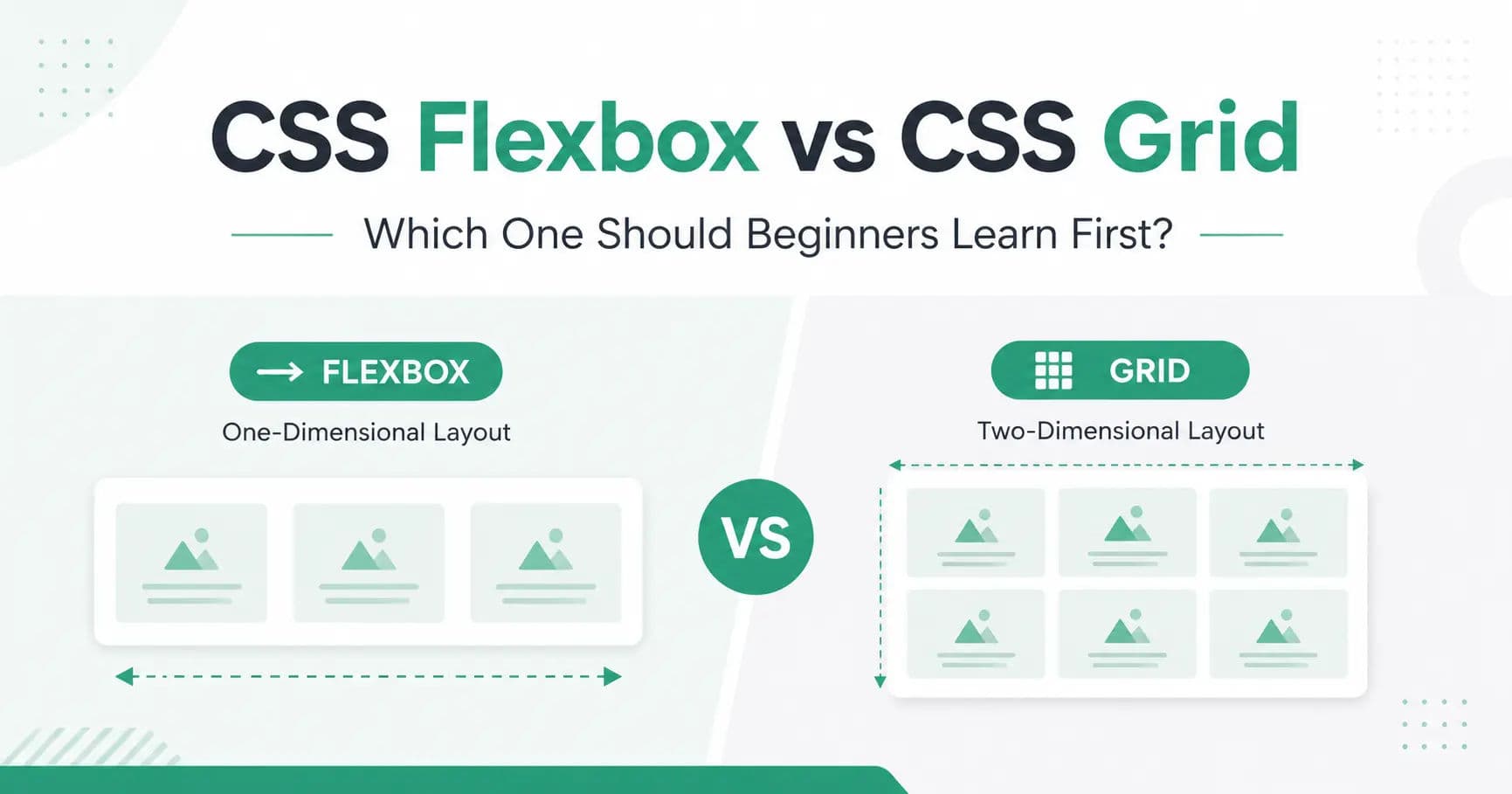
CSS Flexbox is a layout system used to arrange elements in one direction.
That direction can be:
rowcolumn
This is why Flexbox is called a one-dimensional layout system.
Example
html
<!DOCTYPE html>
<html>
<head>
  <title>CSS Flexbox Example</title>
  <style>
    .container {
      display: flex;
      gap: 20px;
    }
    .box {
      background-color: #29AB87;
      color: white;
      padding: 20px;
      border-radius: 8px;
    }
  </style>
</head>
<body>
  <div class="container">
    <div class="box">Box 1</div>
    <div class="box">Box 2</div>
    <div class="box">Box 3</div>
  </div>
</body>
</html>
In this example, all boxes appear in one row.
Flexbox is very useful when you want to align items horizontally or vertically.
Related lesson: CSS Flex Container explains how Flexbox starts with the flex container.
What Is CSS Grid?
CSS Grid is a layout system used to arrange elements in rows and columns at the same time.
This is why CSS Grid is called a two-dimensional layout system.
Example
html
<!DOCTYPE html>
<html>
<head>
  <title>CSS Grid Example</title>
  <style>
    .container {
      display: grid;
      grid-template-columns: repeat(3, 1fr);
      gap: 20px;
    }
    .box {
      background-color: #29AB87;
      color: white;
      padding: 20px;
      border-radius: 8px;
    }
  </style>
</head>
<body>
  <div class="container">
    <div class="box">Box 1</div>
    <div class="box">Box 2</div>
    <div class="box">Box 3</div>
    <div class="box">Box 4</div>
    <div class="box">Box 5</div>
    <div class="box">Box 6</div>
  </div>
</body>
</html>
In this example, the boxes are arranged in a proper grid layout with columns and rows.
CSS Grid is very useful for full layouts and repeated card sections.
Related lesson: CSS Grid Container is a good starting point for Grid layout.
Main Difference Between Flexbox and Grid
The biggest difference is simple:
- Flexbox works in one direction.
- Grid works in two directions.
Flexbox is best when you are arranging items in a row or column.
Grid is best when you are arranging items in rows and columns together with display: grid.
| Feature | Flexbox | CSS Grid |
|---|---|---|
| Layout Type | One-dimensional | Two-dimensional |
| Works With | Row or column | Rows and columns |
| Best For | Small components | Full layouts |
| Beginner Friendly | Easier to start | Slightly advanced |
| Common Use | Navbar, cards, buttons | Gallery, page layout, dashboard |
| Responsive Design | Good | Excellent |
| Can Use Together | Yes | Yes |
When Should You Use Flexbox?
You should use display: flex when your layout mainly moves in one direction.
For example, a navigation bar usually has items in one row.
css
.navbar {
  display: flex;
  justify-content: space-between;
  align-items: center;
}
This type of layout is perfect for Flexbox.
Flexbox is also great for centering content:
css
.container {
  display: flex;
  justify-content: center;
  align-items: center;
}
This will center the child element horizontally and vertically.
For beginners, Flexbox is easier because you can quickly understand alignment, spacing, and direction.
When Should You Use CSS Grid?
You should use CSS Grid when your layout needs rows and columns together.
For example, a card layout:
css
.card-container {
  display: grid;
  grid-template-columns: repeat(3, 1fr);
  gap: 20px;
}
This creates a three-column layout.
CSS Grid is perfect for sections where you want equal columns, repeated cards, or full page structure.
- Blog listing page
- Product listing page
- Portfolio gallery
- Dashboard cards
- Services section
- Tutorial cards
Which One Should Beginners Learn First?
Beginners should learn Flexbox first.
Reason: Flexbox is easier to understand and appears in many common website parts.
After Flexbox, beginners should learn CSS Grid. Grid becomes easier once you already understand layout basics.
| Step | Topic |
|---|---|
| 1 | CSS display property |
| 2 | Flexbox |
| 3 | CSS Grid |
| 4 | Media queries |
| 5 | Responsive layouts using Flexbox and Grid together |
Can You Use Flexbox and Grid Together?
Yes, and in real websites, developers often use both together.
For example, you can use CSS Grid for the main page layout and Flexbox inside each card.
Example
html
<!DOCTYPE html>
<html>
<head>
  <title>Flexbox and Grid Together</title>
  <style>
    .card-container {
      display: grid;
      grid-template-columns: repeat(3, 1fr);
      gap: 20px;
    }
    .card {
      display: flex;
      flex-direction: column;
      justify-content: space-between;
      background-color: #f5f7fa;
      padding: 20px;
      border-radius: 8px;
    }
    .card button {
      background-color: #29AB87;
      color: white;
      border: none;
      padding: 10px;
      border-radius: 5px;
    }
  </style>
</head>
<body>
  <div class="card-container">
    <div class="card">
      <h2>HTML</h2>
      <p>Learn the structure of webpages.</p>
      <button>Start Learning</button>
    </div>
    <div class="card">
      <h2>CSS</h2>
      <p>Learn styling and layout design.</p>
      <button>Start Learning</button>
    </div>
    <div class="card">
      <h2>JavaScript</h2>
      <p>Learn interactivity and logic.</p>
      <button>Start Learning</button>
    </div>
  </div>
</body>
</html>
Here, CSS Grid creates the three-column layout, and Flexbox controls the content inside each card.
This is a very common real-world pattern.
Responsive Layout with Flexbox and Grid
Responsive design means your website should look good on mobile, tablet, and desktop.
With CSS Grid, you can make responsive columns like this:
css
.card-container {
  display: grid;
  grid-template-columns: repeat(3, 1fr);
  gap: 20px;
}

@media (max-width: 768px) {
  .card-container {
    grid-template-columns: 1fr;
  }
}
On desktop, the cards appear in three columns. On mobile, they appear in one column.
You can also use Flexbox for responsive navigation:
css
.navbar {
  display: flex;
  justify-content: space-between;
  align-items: center;
}

@media (max-width: 768px) {
  .navbar {
    flex-direction: column;
    gap: 15px;
  }
}
This changes the navbar from row layout to column layout on smaller screens.
For more layout practice, open the Try It Editor and test both examples live.
Common Beginner Mistakes
Many beginners think Flexbox and Grid are competitors. That is not correct.
They are different tools for different layout problems.
Another common mistake is using Flexbox for everything. Flexbox is powerful, but for full page layouts, CSS Grid is often cleaner.
Some beginners also use too many fixed widths like this:
css
.box {
  width: 500px;
}
This can break the layout on small screens.
Instead, use flexible units:
css
.box {
  max-width: 500px;
  width: 100%;
}
This makes your layout more responsive.
Simple Rule to Remember
Here is the easiest rule:
- Use Flexbox when items move in one direction.
- Use Grid when items move in rows and columns.
| Layout Need | Better Choice |
|---|---|
| Navbar | Flexbox |
| Card gallery | Grid |
| Button group | Flexbox |
| Full page layout | Grid |
| Card content alignment | Flexbox |
| Blog listing layout | Grid |
Final Answer: Flexbox or Grid?
Both Flexbox and CSS Grid are important.
But for beginners, the best learning order is:
First learn Flexbox. Then learn CSS Grid.
Flexbox will help you understand alignment and spacing. CSS Grid will help you create larger and more structured layouts.
Once you understand both, you can create modern, responsive, and professional-looking websites.
You do not need to choose only one. In real projects, you should use both where they make sense.